

This article is not a "wear this and that" guide. You won't find a list of trends to buy immediately. Instead, you'll find examples of how to put together summer outfits – and understand why some combinations catch the eye and others don't. Each look is broken down: what's combined with what, what perception mechanism is behind it, and how it affects the reception. The article can be treated as a guide – to return to, compare with your own clothes, and test the principles in practice.
But before you start reading – try an experiment. Scroll through the article and just look at the pictures. Without reading the text. Remember your impression: what you liked, what didn't catch your attention, what seemed ordinary. Then go back to the blocks with descriptions – where each look is broken down into its primary components: what combination rules were used and why they work. Read it and look at the same pictures again. Has your perception changed? Did you see something you didn't notice during the first scroll? If so – the article worked.
All outfits in the article were created using products from the Spironik.pl store – because the store's purpose is to sell, and that's no secret. But if the article itself proves useful and offers a new perspective on looking at clothes – that's good too. It means it worked.
In the article – three ideas for summer, each with an analysis: how the look is built, why it works, and what principle is behind it.
1. Sensuality without a single unbuttoned button

[Product links: cardigan, satin palazzo, suede bag]
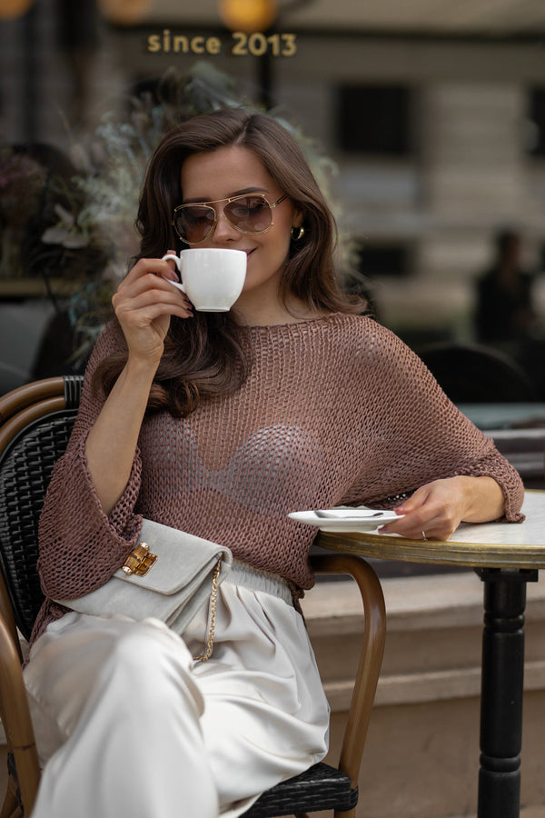
A girl in a chunky knit cardigan and wide-leg trousers. Everything is covered: shoulders, arms, legs all the way to the ground. No deep cleavage, no exposed back. And yet, the gaze lingers. There's something in this image – not flashy, not provocative, but captivating. A quiet intrigue. The look doesn't scream – but you can't walk past it indifferently.
Where does this come from? Let's try to break it down.
First – the cardigan itself. It's loose, openwork, and through it, both skin and underwear are clearly visible. But not directly, rather through the filter of the weave. It's not exposure, but translucence – the body is hinted at, not displayed. And that's where the impression begins.
Second – contrast. The chunky knit against smooth skin makes the skin appear visually more delicate. If it were a smooth jersey, the effect would disappear. But the thick weave next to the skin creates contrast, and the eye begins to read this difference.
Third – the bottom. Satin palazzo pants – flowing, fluid, with a subtle sheen. The top – rough and static, the bottom – delicate and lively. Two opposing characteristics that balance each other – and in this balance, a coherent image is born.
And the palette – caramel and cream – is deliberately quiet. The color doesn't distract, so all the focus goes to the texture. This is a conscious choice.
Palazzo pants, incidentally, are one of the leading silhouettes this season. Perhaps precisely because the wide, flowing leg itself creates a contrast with almost any top. And one more thing – fluid wide-leg trousers from waist to floor create one continuous vertical line. This visually elongates the silhouette – and works for every height and body type.
Two variations – one set

[Product links: cardigan, satin palazzo]
Variant 1: palazzo pants fall freely to the ground, flat mules on the feet. One line from the waist down, without breaks – the silhouette is elongated. Mood – evening stroll, dinner, tranquility.
Variant 2: the same trousers tied at the ankle, high heels. Volume appears at the bottom, the leg is exposed, the proportion shifts. Mood – more confident, more energetic. The same item, a different character. Nothing was added – the proportion changed.
The same cardigan, different bottoms – a different message

[Product links: cardigan, linen culottes, suede bag]
First impression: cozy, calm, everyday. The intrigue that was in the first two variants – disappeared.
In the third photo – the same cardigan, but draped over the shoulders, over a thin knit blouse. Instead of satin palazzo pants – linen trousers.
The contrast has weakened. Between the thin jersey of the blouse and the chunky knit of the cardigan, there's still a difference – but it's subdued. And the linen at the bottom adds its own texture: crinkled, rough, uneven. Rough next to rough – the contrast fades. The look didn't become worse – it became different. Morning with coffee, a stroll, a day off. But the sensuality left with the satin.
One change of fabric at the bottom – and the message changes completely. Not color, not cut. Texture.
Principle: chunky texture next to delicate – sensuality. Chunky next to chunky – calm. By choosing contrast, you choose the mood you want to create.
2a. Linen set for vacation – when you don't want to think

[Product links: linen top, linen skirt]
You look at the photo – and immediately feel: vacation. Midday. Morning fruit market. Although it's just a top and a skirt, there's nothing "beach-like" about the cut.
A girl in a white linen top and a caramel ruffled skirt. The top is not tucked in, the skirt flows freely, the waist is not accentuated. In her hand – a woven bag.
Why is it like this? Because in addition to texture contrasts, which were analyzed in the first block, there's another thing – associations. Throughout life, we see specific combinations in specific contexts and remember them. Crinkled linen, ruffles, a woven bag, exposed shoulders, a relaxed silhouette – the brain has seen all this before: in seaside towns, in photos from Tuscany, in movies. All the elements converged – and the association worked automatically.
A light top and a warm bottom enhance the effect: two different shades divide the figure in half, the gaze doesn't strive for verticality – and this is read as "casual". Nothing pulled up, tucked in, or emphasized.
You put on such a set on an ordinary Tuesday – and you internally switch. Without going on vacation, but simply because the association has done its job: shoulders dropped, pace slowed. Life is the same – your attitude towards it is different.
2b. The same linen – but for the city: one color and one belt

[Product links: linen top, linen skirt]
Boho disappeared. Instead of "vacation" – an impression of order. A cafe terrace, brunch, the city. The same linen, the same cut – but a different reception.
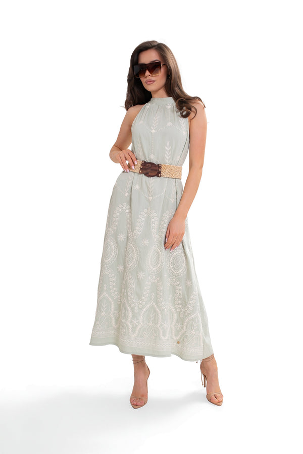
The same model of the set: a camisole top, a ruffled skirt. The same linen, the same cut. But now everything is in one color – mint. The top is tucked in. At the waist – a woven belt with a wooden buckle.
What specifically switched?
One color removed the "break" between the top and bottom. When the shade is one – the figure is read as a whole, without dividing it in half. This immediately gives the feeling: this person thought it through. And at the same time – one color from top to bottom visually elongates the silhouette. The eye flows, not stopping at the boundaries. This works for every figure.
The belt added one clear horizontal line at the waist. And that was enough for the crinkling of the linen to stop looking chaotic. Next to the even line of the belt, the crinkling is not sloppiness, but the character of the fabric. Without the belt, the brain reads "wrinkled". With the belt – "it was meant to be like this".
And the belt here is not leather, not shiny – woven, with a wooden buckle. It doesn't break the association with naturalness, but adds structure to it.
2c. Different colors, different top – and Provence disappears

[Product links: blouse, linen culottes]
Provence gone. Boho gone. Before us – something urban, calm, everyday. The same cut of linen culotte skirt, but the impression is completely different.
In the photo – the same linen culotte skirt, but in blue. Instead of a loose linen top – a fitted long-sleeve blouse in ecru. A woven bag with colorful straps on the shoulder, beige mules.
What changed? The fitted top instead of a loose one changed the proportions: the body gained contour, the silhouette became clearer. Loose linen on top and bottom – that was the set of signals that sent us on vacation. When the top clings to the body and the bottom remains loose – a contrast of volume appears: tight and wide. And the brain reads this contrast differently: order, balance, city.
The color also played a role. White and blue is a combination that carries its own association – freshness, purity, cool energy. Not warm caramel and ecru as in the Provençal version, but a cool pair that is associated with urban summer.
The woven bag with colorful straps – the only element that could lean towards vacation. But in the environment of cool tones and a fitted top, it works differently: as a color accent, not as a "beach" signal.
Principle: associations are an instrument just like texture or color. The same clothes can "send" you to the beach or to the city – it depends on what signals are brought together. Changing the color unity, swapping a loose top for a fitted one, adding one element of structure – and "vacation" turns into "style". Just a few details are enough to change not only the perception of the surroundings, but also your own feeling within these clothes.
3. Striped shirt – an item that takes all the attention
A striped shirt is an item that doesn't need to be called a seasonal trend. It's always fashionable. It reappeared at the 2026 shows – but not as a comeback, but as a reminder.
In three photos – the same striped shirt. But see how differently it is perceived.

[Product links: striped shirt, linen culottes]
First impression – something formal, almost office-like. An association flashes: teacher, business meeting, dress code. Serious, mature, organized.

[Product links: striped shirt, jeans]
And here – a completely different person. A student, a walk with friends, Saturday, hot weather. Lightness, movement, nothing superfluous.

[Product links: striped shirt, bomber jacket]
Here – orderliness, neatness, precision. Every detail in its place. Not stiff, but thoughtful.
Three photos – and three different impressions. Although the shirt is the same. Why is that?
Because a frequent, rhythmic pattern – like this vertical stripe – acts as a strong visual magnet. It attracts the eye first. Not jeans, not shorts, not culottes – the eye first catches the stripes. And it reads them: how they are arranged on the body, how much is visible, how they end. Everything else is perceived afterward, as background.
That's why every way of wearing this shirt changes the impression so much. The pattern attracts the eye – and the eye sees:
Untucked – the stripes cover the entire torso with a regular rhythm, and the brain reads this as order, formality. Tied in a knot – the stripes are shortened, raised, exposed skin appears, and the brain switches: casual, light, summer. Tucked in and belted – the stripes are compressed into a frame, concentrated, and orderliness, neatness are read.
You're not changing the shirt. You're changing the surface and placement of the accent on the body – and the impression rebuilds itself.
By the way – about the stripes themselves. Vertical lines guide the eye from top to bottom and visually slenderize. Horizontal ones – conversely, widen. This is neither good nor bad – it's a tool. If you want to elongate the silhouette – a vertical stripe will help. If you want to add volume – a horizontal one. Knowing this, you choose consciously, not accidentally.
And one more point. In all three photos, everything next to the stripes is monochromatic and calm: white linen, light denim, a blue bomber. Nothing competes with the pattern. This is a technique: when there's an element with a strong visual accent in a look – give it space. One pattern solos, the rest supports.
Principle: a frequent rhythmic pattern draws attention and becomes what the eye reads first. By changing the surface and placement of this accent on the body – untucked, tucked in, tied – you change the impression without changing the item itself. And for the accent to work fully – don't place another one just like it next to it. One strong pattern per look.
The circle closes – and this is just the beginning

[Product links: striped shirt, cover-up, jeans, suede bag]
The student is gone. The stripes, which were previously soloing, now only show through the thick weave. The look has become quieter, deeper, more complex.
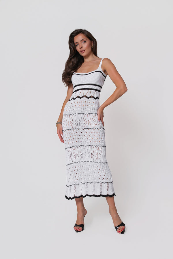
Last photo. The same striped shirt from this block. The same jeans. But on top of the shirt—the white openwork cover-up from the very beginning of the article.
The stripes, which previously commanded all attention, are now under an openwork filter. The pattern hasn't disappeared—it shows through the thick weave. But its intensity is subdued; it has stopped shouting. Instead of one strong accent, there's an overlay of two textures—and the look has become complex, quieter, deeper.
In the first block, the cover-up lay on the skin and created sensuality through the contrast of rough with delicate. Here, it lies on the pattern—and works differently: as a filter that tames the visual accent and adds a layer.
The same item—but in a different combination, it solves a different task. This is an option for a cooler summer evening—in full sun, two layers won't be the most comfortable.
Actually—this is the crux of the entire article. There are no clothes that "work" or "don't work" on their own. There are contrasts of textures—rough next to delicate. There are associations—which switch with one stripe or a change of color. There are strong visual accents—which can be strengthened, subdued, or shifted. And all of these—are tools that can be combined. Sometimes, it's enough to change one detail—and not only the look changes, but also the feeling within it.
The article has dissected three principles using several examples. But there are more principles—and even more combinations between them. Other principles will be analyzed in subsequent materials: how proportions work, what a single strong colorful accent does to a look, and why the same item tells different stories on different body types.
What do you think?
This article is not a traditional product review—it's an attempt to break down looks into the principles behind them. The format is experimental, and that's why your opinion is important: is this way of talking about styling—with an analysis of contrasts, associations, and perception—more interesting than simple "what to wear with what" comparisons?
Write in the comments: what was useful, what was missing, what topics you would like to see in the next article. Every comment is read and considered.


0 comments